top of page

PROJECT OBJECTIVE
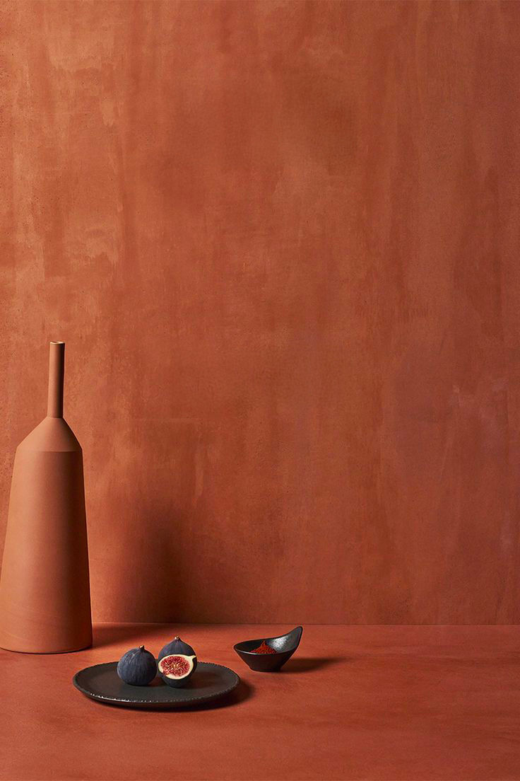
Refine the Harvest & Co logo into a sleeker, modern iteration by transitioning from a bold font to a lighter weight, enhancing overall elegance while preserving brand recognition for the Dubai based farm to table restaurant.
This update aligns with the H&CO visual identity, making it more versatile for digital platforms like Instagram (@harvestandco.dubai) and print materials such as menus and packaging. The lighter font will convey a fresh, approachable vibe that complements the farm to table aesthetic without losing the core harvest theme.

Insert text here
CREDITS.
DESIGN TEAM.
insert here
MARKETING DIRECTOR
insert here
FOUNDER
insert here
details here


ABOUT.
aa
insert here
bb
insert here
cc
insert here
details here

bottom of page